Goal #5
Conduct a Design Sprint to discover design solutions for the "Open in Office Mode" feature.
After the L700 or Wallreaders are installed upon any door, the doors stay locked. Every time somebody wants to enter a place, they must use a pass(digital key) to open the door. On the other hand, other products on the market, such as the RFID cards, which many companies use at their offices, provide a feature to leave the door unlocked whenever the user wants. For example, when a guest or employee holds the RFID card longer on the electrical sensor, the door stays unlocked. So, employees or guests don't have to use the pass every time they want to enter the kitchen, common areas, or waiting rooms.
The Sales team got feedback from customers, and I observed during one of my site visit that co-working spaces need to leave some doors open during the day. For example, one of our customers put a holder upon the doorway. So, the door is left ajar, and the receptionist doesn't have to open the door when a guest or postman arrives. They found a solution by themselves, but providing a lasting solution is vital for them!
The user's goal was to leave some of the entrances (main entrance, kitchen, etc.) ajar at any time they wish; the business goal was to fulfill the customer needs.
As I mentioned in the Pain Points section, our target group(many companies) is already using RFID cards. So, it's nice to mimic that interaction (holding the RFID card few seconds above the sensor). We had to figure out how to do it and include interdisciplinary teams to figure out technical barriers not to lose time.
On the other hand, we already had an 'Open Door' CTA on each pass that triggers to unlock the door only for a few seconds. We must be sure that it's clear for the user 'Open Door in Office Mode' leaves the door unlocked during the defined period. It's risky if they don't understand the difference and leave the door open unintentionally. The devices' communication is also only from the phone to the sensor; we couldn't provide feedback to the user if the door left unlocked.
Conduct a Design Sprint
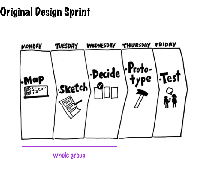
Original Design Sprint
The original Design Sprint takes 5 days and the whole group is included for three days.
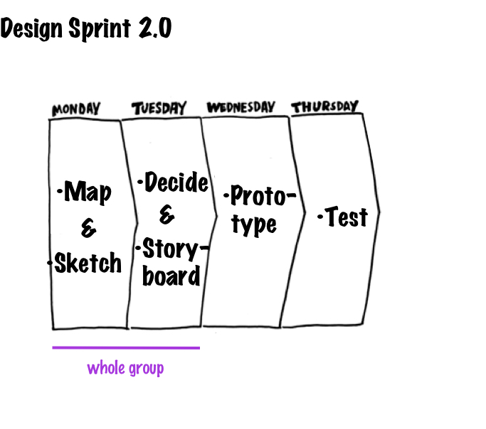
Design Sprint version 2.0
As many designers tailer the Design Sprint regarding their needs, we also used Design Sprint version 2. Because we had time limitations to include the whole group for three days, and we had to focus only on the "Office Mode" feature.
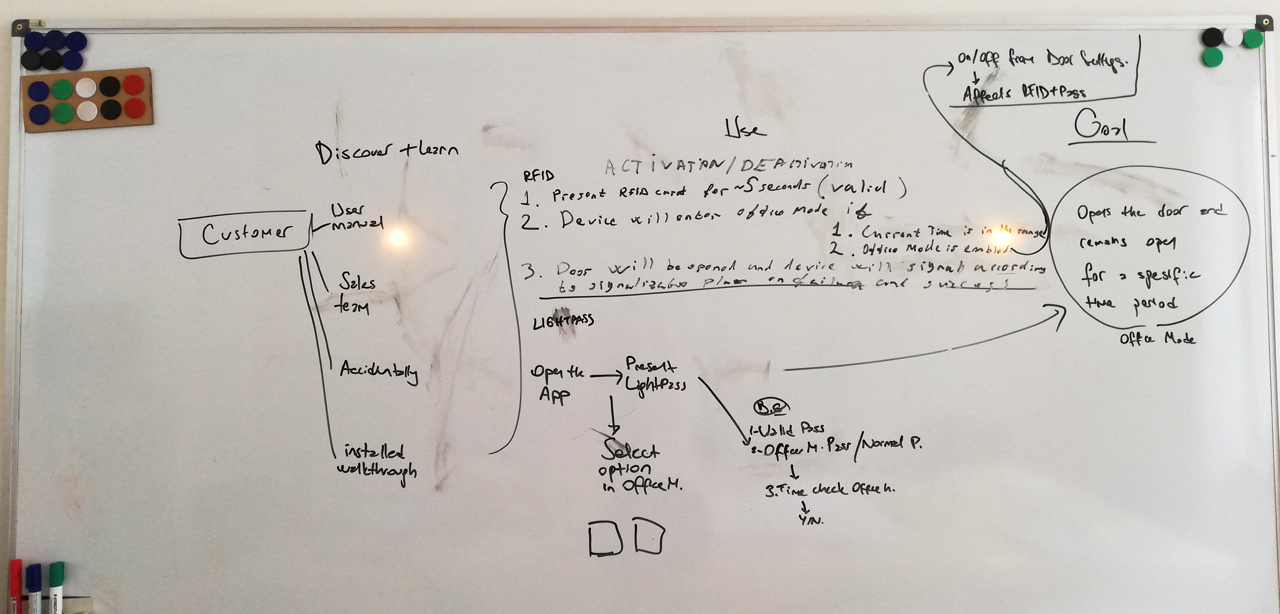
We started to map the feature called "Office Mode" with the whole team to understand the big picture. In the meantime, the group already started to ask questions. I began to write them down.
Why are we adding this feature right now?
What is the goal of this feature?
How could we not fail, there are many technical and time limitations?
We also determined some technical barriers with the feedback from the development teams (noted as Dev Teams) and expected interaction from the customer's perspective while we were mapping. Everyone also started to write down the obstacles to the sticky notes. So, we could turn them into solutions in the "how might we?" step. Let's call the customer, "John".
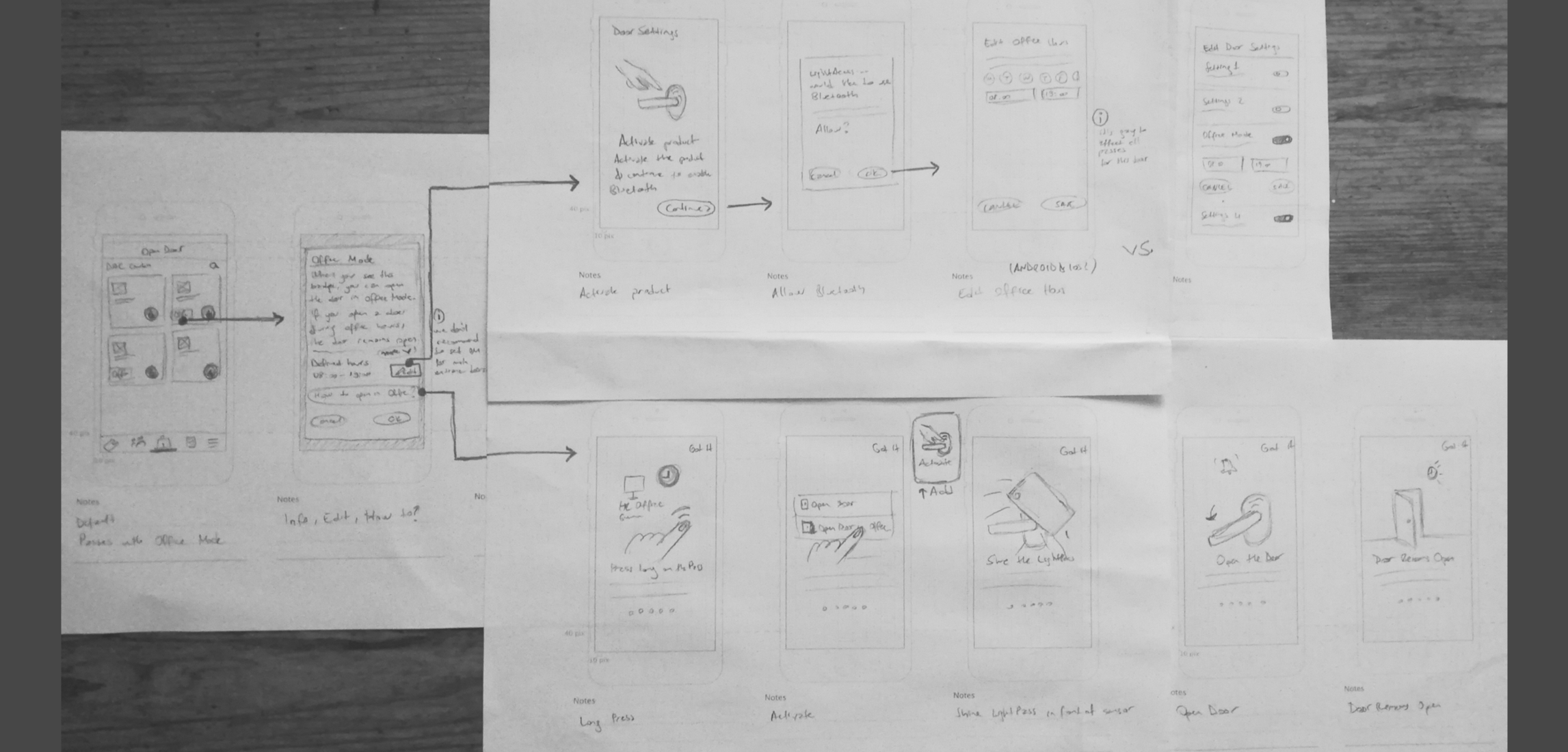
Can John enable the office mode feature on some of the doors and just open it? So, he doesn't have to select "open in office mode" every time he opens the kitchen.
Why can't John activate office mode with Bluetooth(BLE) connection? So, we could give feedback on the phone.
Dev teams: No, because the system should display a different LightPass to define that the door should stay unlocked. The user should trigger it through the phone. Maybe we can find another solution, but we need Bluetooth(BLE) connection for two-way communication. That is quite unrealistic because it's too much effort for a user to turn the BLE on every time they want to open a door. Keeping BLE on all the time has disadvantages like consuming battery.
What if John tapped in "Open in Office Mode" accidentally? It's risky to leave a door unlocked unintentionally. So, feedback is crucial!
If we want to provide feedback through the phone that the door will stay unlocked during the defined period, the phone's Bluetooth connection should be ON. That is again quite unrealistic because it's too much effort for a user to turn the BLE on every time they want to open a door.
We must provide "Lock the Door" for this kind of cases.
What kind of feedback can we provide to the user without a BLE connection?
We can provide different sound feedback than the usual door opening.
How would John expect to edit/display the defined Office Time of each door?
We assume that John expects to define the Office Time through Door Settings.
Dev team: It's not possible to define it without BLE connection. Two-way communication is needed. He should connect the BLE of his/her phone to display and edit each door's defined Office Time.
The interaction might be complicated for novice users due to technical barriers. How might we teach it?
There must be visual instructions that are discoverable or guided tours at the beginning of the installation.
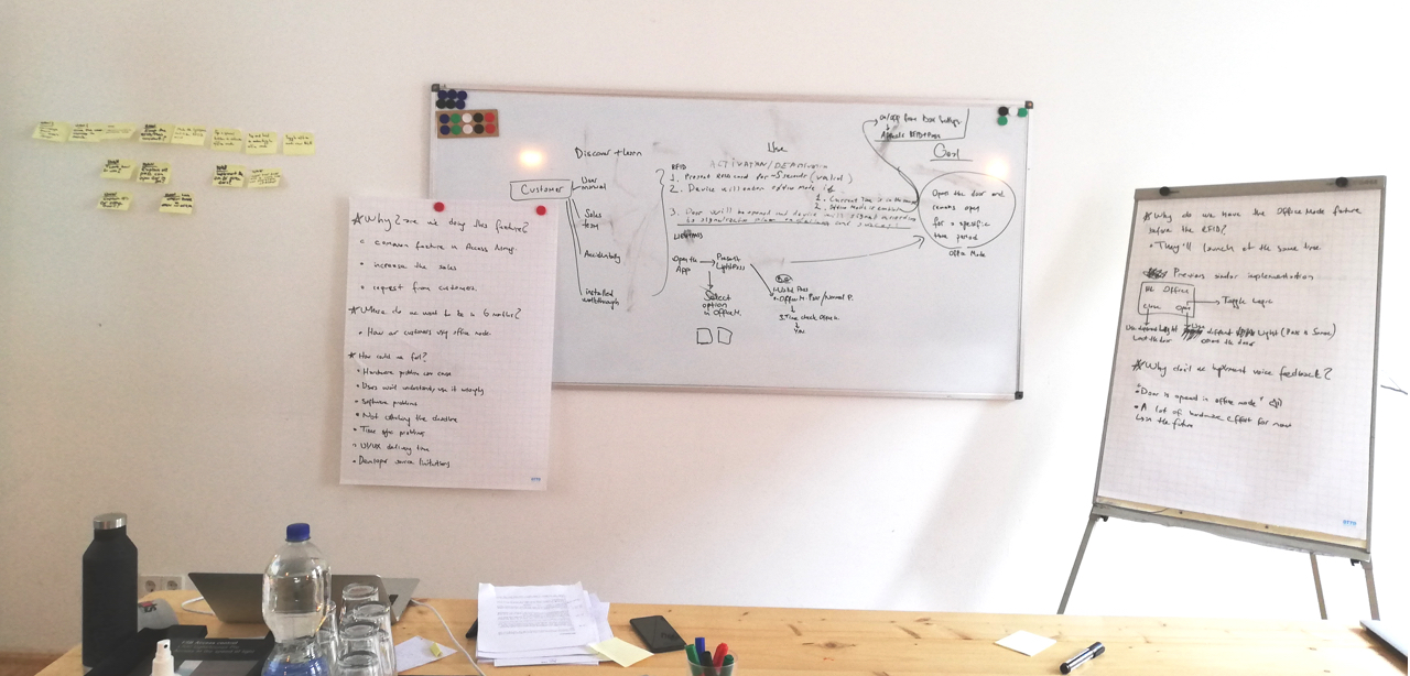
We focused on the HMW situations below, while the whole team was looking for inspiration and sketching.
How might we make the LightPass interaction similar to RFID cards?
How might we minimize the number of taps while opening a door?
How might we toggle Office Mode over BLE?
How might we prevent accidental usage?
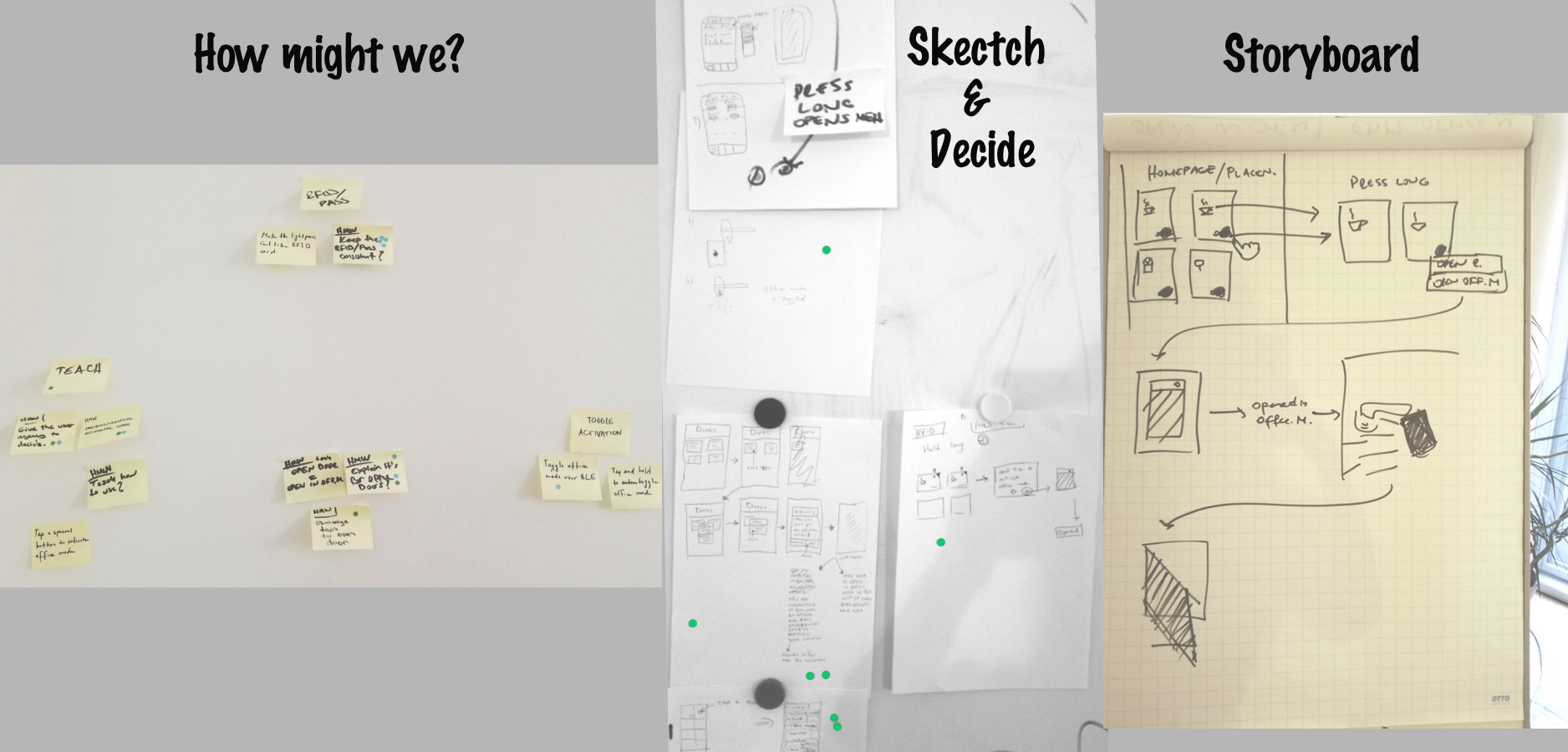
Tuesday
Decide & Storyboard
Since we already got tons of requests for this feature, I witnessed the pain point on one of my site visits (I explained at the beginning of this section). We already picked the target: implement a feature that lets users leave some doors unlocked for a defined period: Office Mode.
We voted the most useful "How might we?" notes and focused on these areas while looking for solutions and sketching. The two topics got the maximum votes below:
How might we make the LightPass interaction similar to RFID cards?
How might we prevent accidental usage?
It was impressive that some developers got inspired by car features or competitors. After the final decision, I draw the storyboard. So, we shared understanding among the whole team members.
I was ready to develop the prototype and test it with our target group!
I created the wireframes with pen & paper before jumping into InVision. I also got final confirmation from developers. Since we had most of the UI designs, I retouched the missing ones. I built the prototype in InVision.
I tested the prototype with participants of different age and gender groups at one of our customers' offices in Berlin. The number of participants was five.
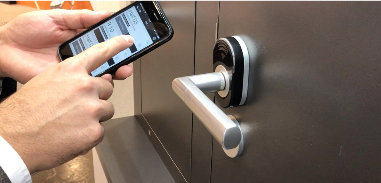
You work at DAC Gmbh. Your company uses L700 (show the product) at the building. The mobile app lets you open any door with any phone in a highly secure way.
Assume that you have an account and use the app. Can you try to figure out how you would open "Meeting Room" via the app?
As you just experienced, you used the pass and entered a place. When the door was closed after you, it is locked again. So, another person who wants to enter here must use a pass too.
Suppose there's a function in the app that can leave any place like "Smoking Room" unlocked. So, after you used the pass and entered, the next person doesn't have to use a pass again. Can you try to discover and use this feature in the app?
There's a feature in the app that lets you leave some doors unlocked after the first pass usage for a defined interval. So, the employees or guests don't have to use the pass every time they want to enter the kitchen, common areas, or waiting rooms.
Where would you expect to set this feature for "Tea Kitchen" in the app?
How would you check to see if you could open the door in Office Mode or not? (It remained unlocked after you.)
Where would you expect to find some more information about this feature in the app?
Where would you expect to find the Office Mode interval of the Smoking Room?