Section #1
Visual Desing Guideline
Creative process
Sketches, Wireframes
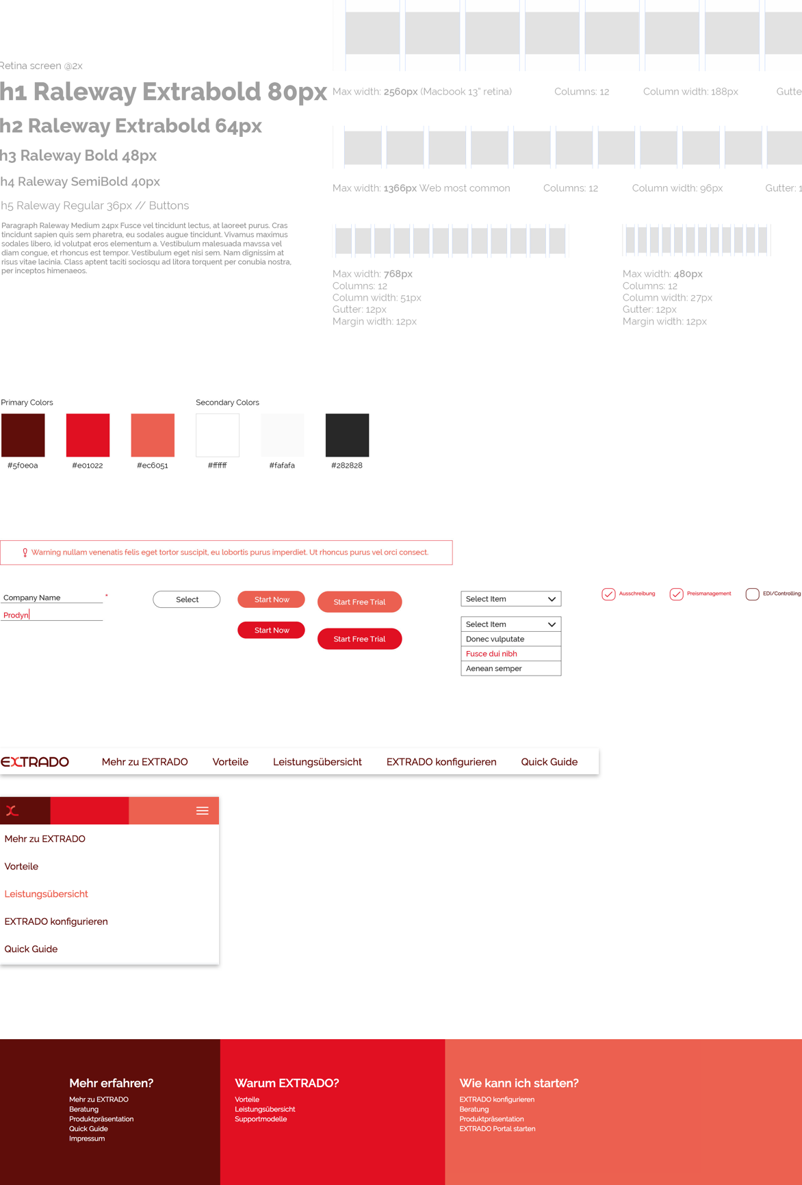
I created the visual design guideline, which contains the primary and secondary colors based on the logo, breakpoint, and grid definitions on desktop, tablet and mobile, font family and size definitions, UI elements (text fields, buttons, dropdowns, etc.), and the tone of imagery.
Section #2
Wireframes
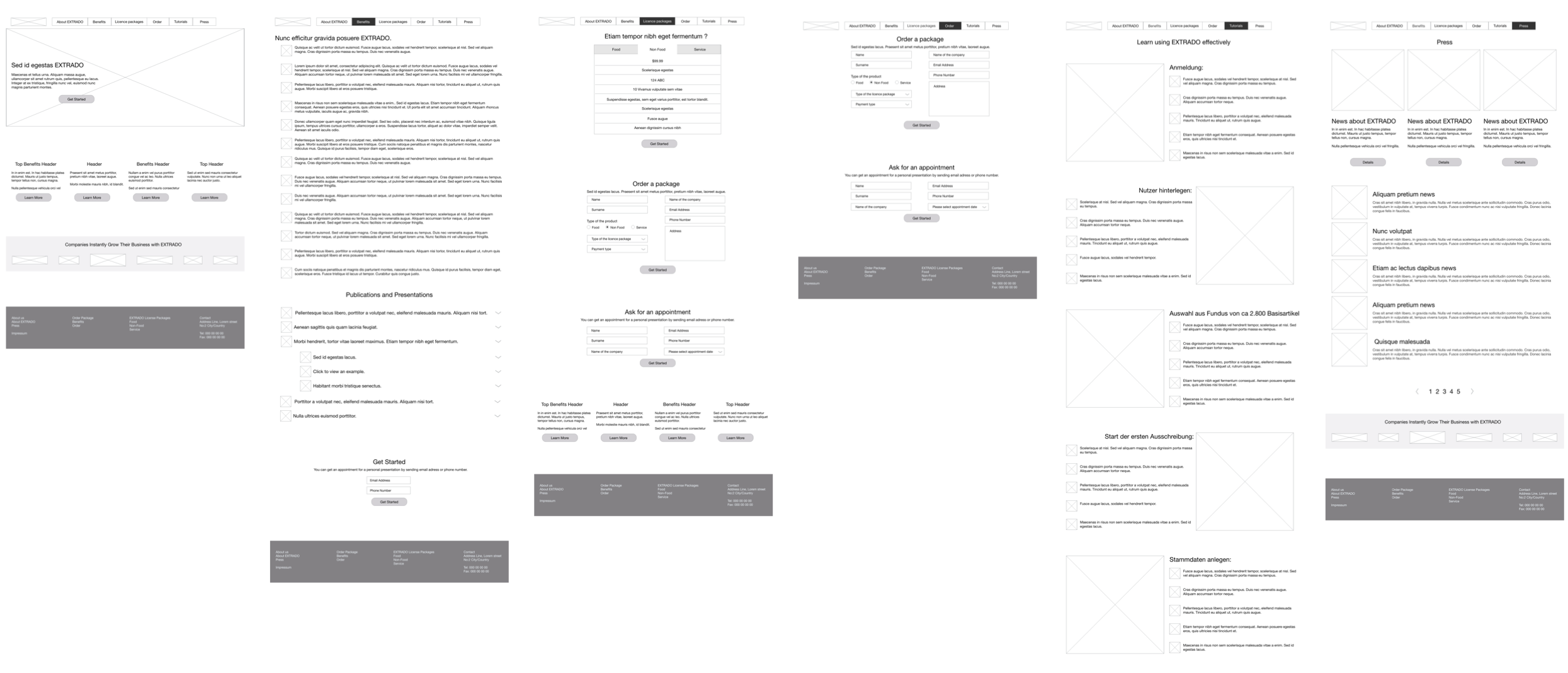
Reusable design components
Wireframes
I designed reusable design components: order and contact forms, right and left-aligned content groups with a photo, 3-column photo+content+CTA button combinations, a content list with pagination for the news section, etc. In that way, the client could combine the components and create new pages regarding their needs in the future.
Product and Press pages
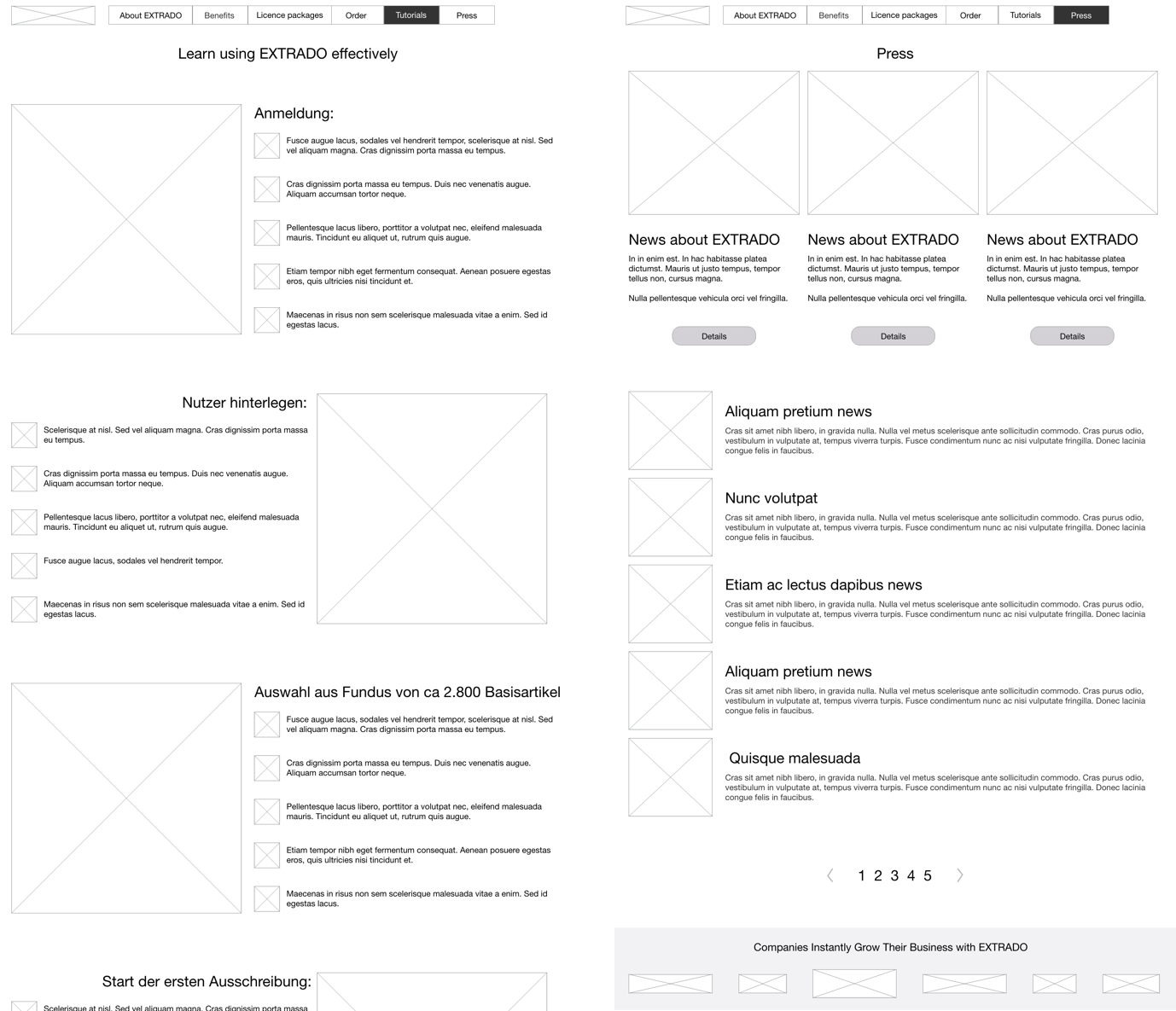
Catch the user's attention
Wireframes
I worked closely with the client during the wireframe creation process and focused on balancing user and business goals. It was essential to provide more information about the product as a summary. So, I mostly used bullet points instead of long paragraphs combining with photos. Thus, the user could get the relevant information quickly, and the client could catch the user's attention immediately.
Homepage
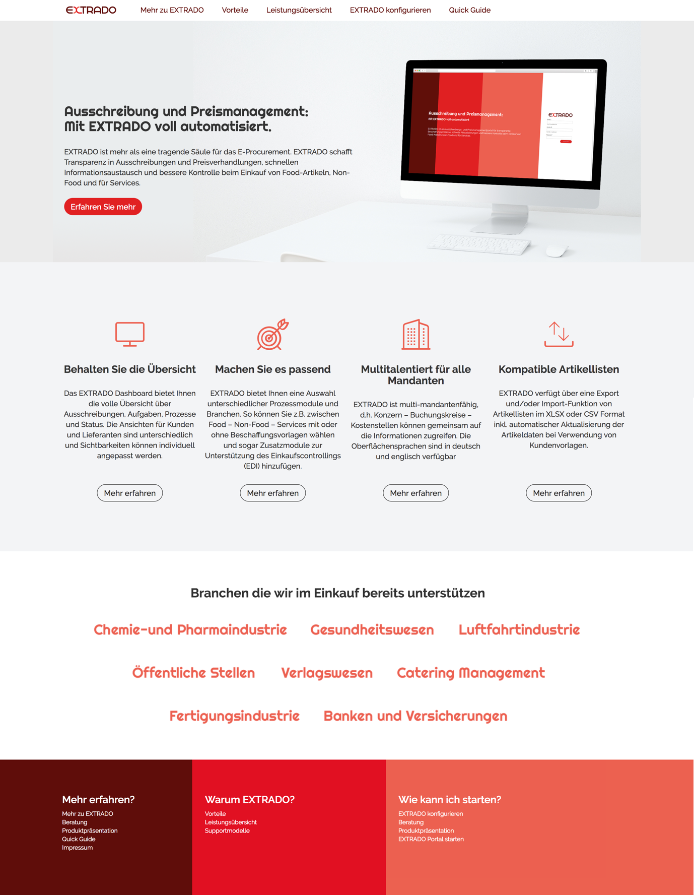
The focus on the homepage was to provide a quick overview of the product benefits and direct users to get more info plus contact with a consultant to become a member.
Order Page
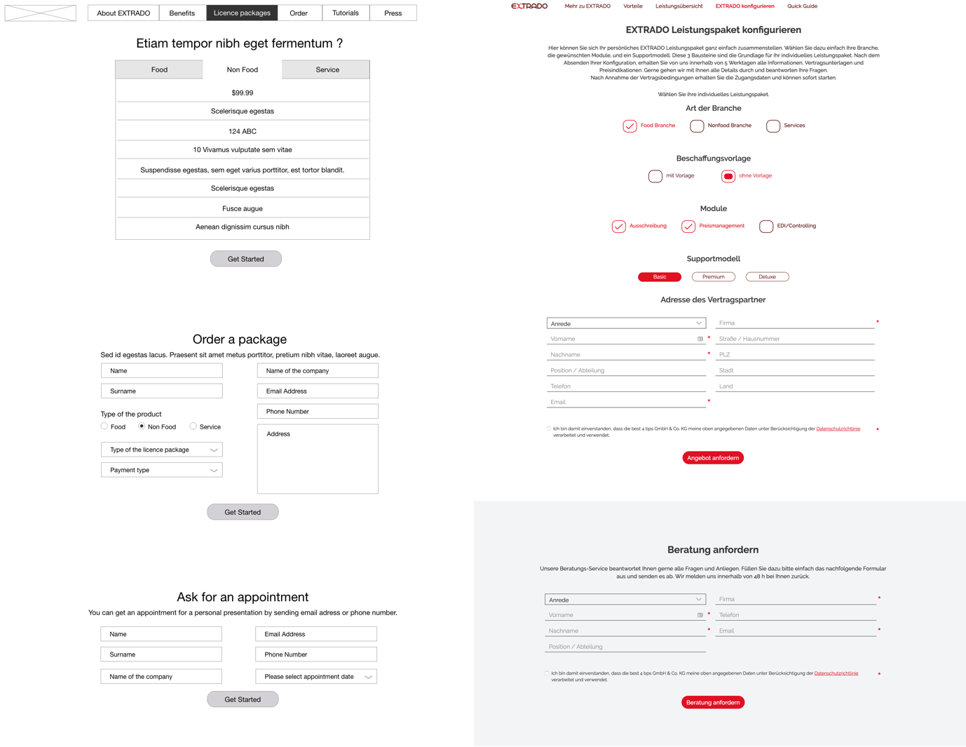
The focus on the order page was to get information from the customers to offer the best package and provide relevant consultancy. The UI was designed in 2015; what I would change in the visual design is to align the design elements to the left since I've learned that as we read from left to right, it's faster to scan the left-aligned content than center-aligned content. I would also hide further options (checkmark and radio button) and display them after the proper choice.
Main navigation
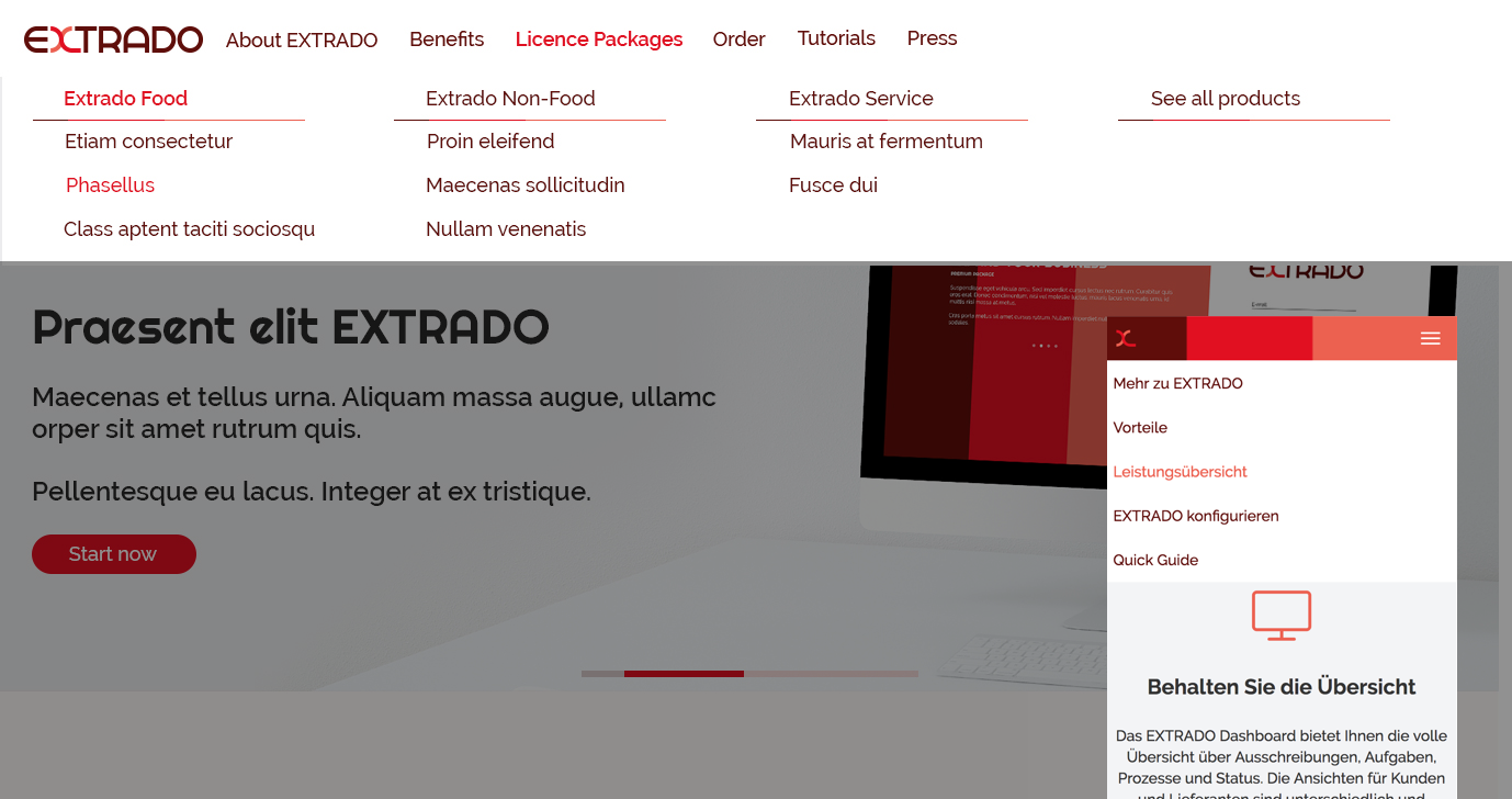
I chose to use mega navigation on desktop. In that way, the client could showcase all of the alternatives in each category, even directing the user to the order page; the user could get the overall features at a glance and navigate through the information he/she needs.
Section #3
Web app Login page
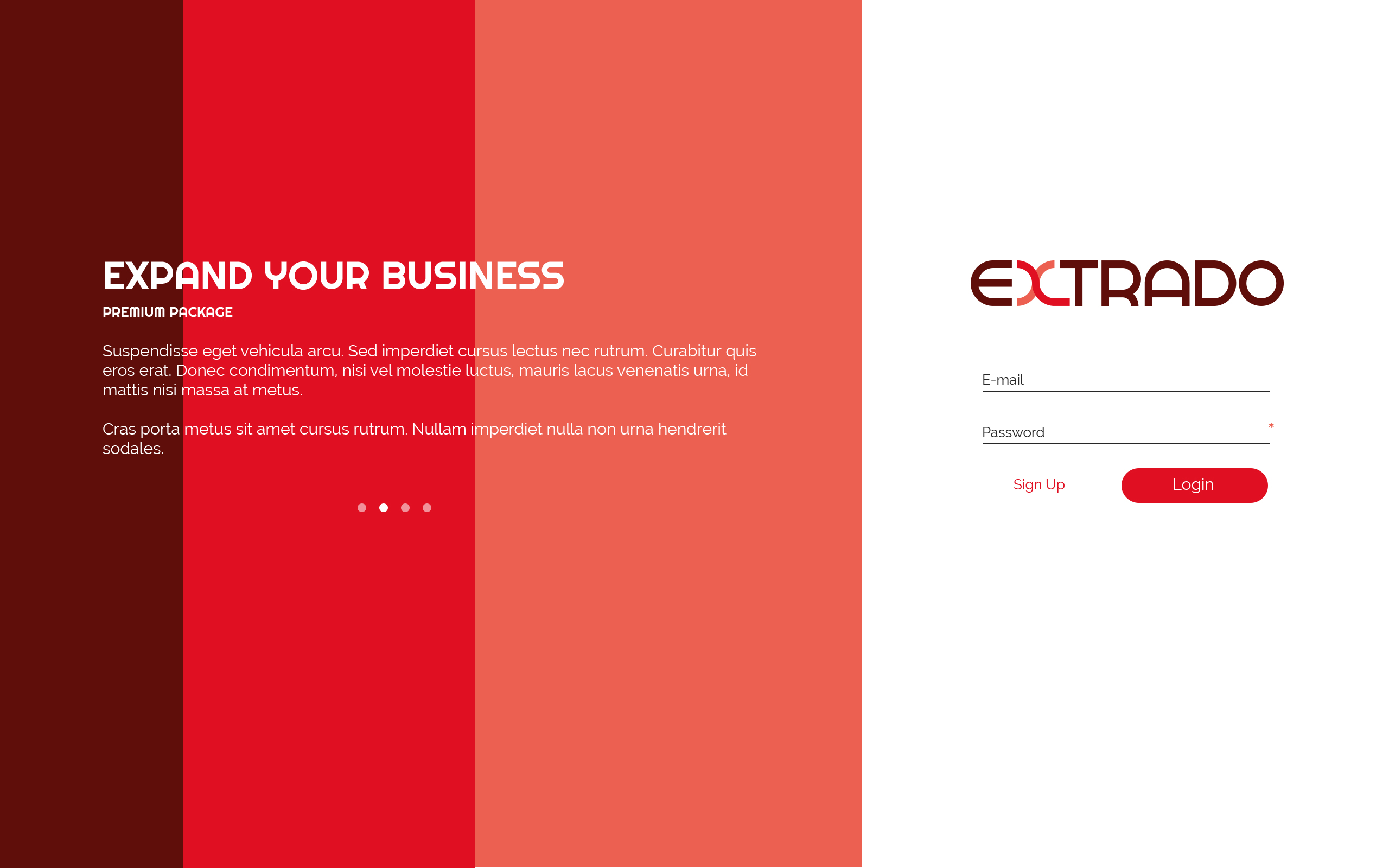
Designing the desktop app
I designed the UIs for login and dashboard pages. The client already had defined the features and provided the wireframes, I only implemented the visual design guidelines on the dashboard.
Web app dashboard
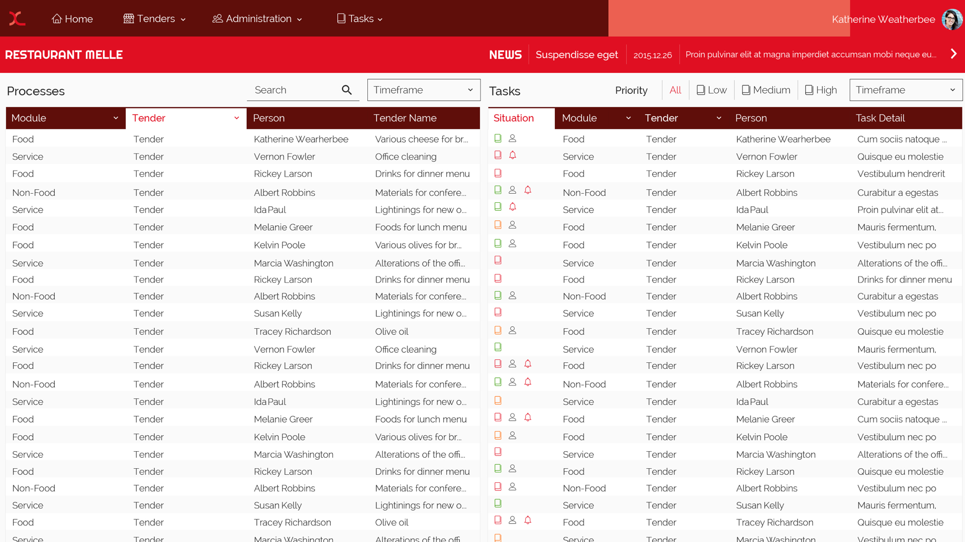
I designed the EXTRADO website and the dashboard in 2015. As I mentioned some of the UI/UX improvements above, I would define some of the design elements and the visual logic differently. For example, I would remove the color from the icons and use it only with the items that provide action (button, link, etc.) since the user tends to tap/click on colorful elements. On the other hand, we got positive customer feedback with this version. The three-color combination, which also used in the login page of the desktop app, in top navigation of the mobile version and in footer design created a unique brand identity matching with the logo.
