Blossom Blast Saga

My Role: UX Designer (Heuristic Evaluation)
About the Product
Blossom Blast Saga is a mobile casual game. The players' goal is to follow Blossom the bee as they link the same colored buds as many as possible. So, they can destroy the weeds with the blasts and grow the flowers and collect the highest points.
Overview
Product: Casual Mobile Game
Company: King.com
Date: May 2020 — Jun 2020
Duration: 1 week
I conducted a Practical Exercise during the recruitment process at KING.com, the casual mobile game company.

A structured and well-paced player onboarding can make all the difference in engaging players. My task was to perform a Heuristic Evaluation of the player onboarding for the Blossom Blast Saga mobile game. So, I provided a Heuristic Evaluation report that was also  answering the following questions:

a. What is done right? 
b. What could be done better? 
c. How can it be improved? 
My Contributions
Date: May 2020 — Jun 2020
Duration: 1 week

Let's start!

I follow Nielsen Norman’s 10 Heuristics to perform heuristic evaluation. In this version, I merged one of the latest studies belong to Granollers T.(2018). The study called Usability Evaluation with Heuristics, Beyond Nielsen’s List and published on ACHI 2018: The Eleventh International Conference on Advances in Computer-Human Interactions.

10 Usability Heuristics for User Interface Design.
By Jakob Nielsen on Apr. 24, 1994; Updated Nov. 15, 2020.
Starting Point

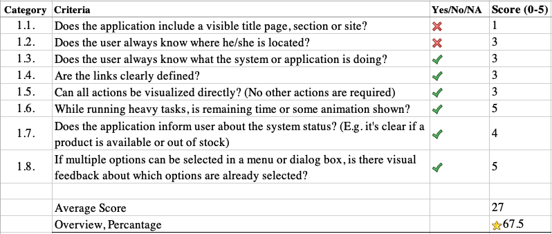
Heuristic 1: Visibility of system status

The design should always keep users informed about what is going on, through appropriate feedback within a reasonable amount of time.

When users know the current system status, they learn the outcome of their prior interactions and determine next steps. Predictable interactions create trust in the product as well as the brand.
1. Visibility of system status

Screens:

1.a. What is done right?
  • Having the level map on the homepage helps the user understand where he/she's located in the app and where he/she can navigate.
  • The app shows an animation while running heavy tasks. For example: while the user sends life to a friend.
  • CTA button color is consistent overall in the app.
  • The Blossom guides the user with the hand gesture animations which action to take during the onboarding process.
  • The information the user needs while playing a game is available on the play screen: how many moves are left on top, the goal, no boosters available/not available, and the settings in the bottom.
  • After the user made a move on the play screen, the progress bar shows the progress on top through the goal. So, the user knows how many moves are left to reach a goal.
  • While the user links a bud, the other progress bar shows the power of the move. So, the user knows how big a blast will be and the result of his/her actions.
1.b. What could be done better?
  • Apart from the level map on the homepage, the app should include a title on each level screen. In this way, the user knows at which level he/she is playing.
  • On the homepage, the live, golden information on top, settings at the bottom, and the user's current location(level) are difficult to notice.
  • The Main CTA color(green) is used for secondary actions. E.g., while the user is selecting the friends to send lives, the checkboxes are green.
  • The information the user needs while playing a game is not clear at first sight. It takes time to understand that the bucket is counting down the moves.
  • If the user misses the goal at the beginning of the game (the user might not catch it), this information is no longer available. Naming the goal as "4 big buds" or "30000" is not clear for novice users to understand.
  • The app shows an animation while running a heavy task, but it doesn't offer any feedback after sending life to a friend. The user doesn't know if it's been sent or not.
1.c. How can it be improved?
  • A level title can be added on top of each screen in which the user plays the game. You can see a screen example on the shared screen above(1.c. Clear Goals & Start) that includes titles for the moves, goals, level, etc.
  • A consistent UI set can be defined as text fields or checkboxes to distinguish from CTAs.
  • The UI should be visually distinguished from the background to perceive the live, golden information on top, settings at the bottom, and the user's current location(level) on the homepage and other screens.
  • A level title can be added on top: "Moves".
  • A level title can be added on top: "Goal".
  • A Feedback/Status can be displayed after the user sent life to a friend: "It's pending, Received, etc."

Heuristic 2: Match between system and the real world

The design should speak the users' language. Use words, phrases, and concepts familiar to the user, rather than internal jargon.

Follow real-world conventions, making information appear in a natural and logical order.The way you should design depends very much on your specific users. Terms, concepts, icons, and images that seem perfectly clear to you and your colleagues may be unfamiliar or confusing to your users.
2. Match between system and the real world

Screens:

2.a. What is done right?
  • Most of the information appears in a logical order for the user, and the icons correspond to everyday objects. For example, the user sees the power progress while he/she links a bud. A bucket full of water counts down the actions that correspond to watering a plant in real life.
  • Most of the icons do the action that the user expects.
  • The system uses phrases and concepts familiar to the user. For example, the placements of the goal, move, etc.
2.b. What could be done better?
  • On the play screen, the progress bar that shows the goal progress is colorful. It confuses the user when it becomes red. It seems 's a negative outcome.
  • On the homepage, there's a countdown timer next to the heart icon. It's not clear what it means.
  • The icon designed as "double heart" on the homepage doesn't reflect sharing action.
2.c. How can it be improved?
  • The progress bar can be only one color, or the colors that usually indicate an error like orange and red should be removed on the play screen.
  • The "share live" page can be re-designed. The information, including countdown and sharing lives, should be displayed logically with necessary details.

Heuristic 3: User control and freedom

Users often perform actions by mistake. They need a clearly marked "emergency exit" to leave the unwanted action without having to go through an extended process.

When it's easy for people to back out of a process or undo an action, it fosters a sense of freedom and confidence. Exits allow users to remain in control of the system and avoid getting stuck and feeling frustrated.
3. User control and freedom

Screens:

3.a. What is done right?
  • If the user follows back (the swiping gesture) the same bud link, he/she can undo the linking action.
  • A link to come back to the initial state or homepage is always available in the bottom navigation on the playing screen.
3.b. What could be done better?
  • If the user wants to leave the play screen for an emergency reason or go back to the homepage, he/she loses one life.
  • Sometimes the user can accidentally stop linking a bud but can't take the action back.
  • While the user links a bud, he/she should be careful to undo the action.
  • While Bloom is instructing about using a shovel boost, if the user does the action wrong, he/she loses a life.
3.c. How can it be improved?
  • It can prevent users from cheating to make them lose a life if they leave a play screen. In that case, a pause option might be provided. On the other hand, it should be discussed how to improve it with other team members (game design & development).
  • While the user links a bud, the visual feedback can be more highlighted, and a gesture can be taught to the user at the beginning of the game. For example, a very long press on the same spot can show a cancel action.

Heuristic 4: Consistency and standards

Users should not have to wonder whether different words, situations, or actions mean the same thing. Follow platform and industry conventions.

Jakob's Law states that people spend most of their time using digital products other than yours. Users’ experiences with those other products set their expectations. Failing to maintain consistency may increase the users' cognitive load by forcing them to learn something new.
4. Consistency and standards

Screens:

4.a. What is done right?
  • Starting a game is similar to other games that has a level structure. So, players are familiar with that.
  • When the user starts a level, the app shows the information and the pages consistently.
  • The necessary information is displayed consistently on every page.
  • Most of the icons have the same meaning everywhere.
  • The same actions usually have the same results.
  • When the user completes each level, the app shows the score, data, and pages always in the same pattern.
  • The user profile is displayed under the sidebar, which is a typical pattern.
4.b. What could be done better?
  • Some of the actions don't have the same results. For example, while the Blossom gives instructions about linking the buds, the hand animation appears, and the user takes action (basically can repeat what the app recommends). However, when it teaches how to use the shovel, it is not clear what to do. Because the user must tap on a spot to select a target. After tapping, the Blossom breaks the chosen destination(pot/glass) without any feedback and disappears.
  • The "share live" icon on the homepage could be considered to re-design. It is not straightforward.
4.c. How can it be improved?
  • While the Blossom gives instructions about using a shovel boost, the system can provide the instructions in two steps. First, the hand animation appears with the information "select a target to break a pot/glass," after the user tapping on a spot, the app shows a "Confirm target" button. After the user taps on the confirm button, the app offers a "Break!" button. After tapping on the "Break!" button, the Blossom breaks the chosen destination(pot/glass), the app provides feedback: "Lovely, etc.", and Blossom disappears.
  • As mentioned in 2.b. section, the icon designed "double heart" on the homepage doesn't reflect sharing action. The icon design can be like a heart with a share icon.
  • The settings icon in the bottom navigation can be replaced with a hamburger icon, which better reflects a sidebar function.
  • The checkboxes on the "share live" screen look like filled/selected. Since the CTA buttons are green, the checkbox seems like kind of a button.

Heuristic 5: Recognition rather than recall

Minimize the user's memory load by making elements, actions, and options visible. The user should not have to remember information from one part of the interface to another. Information required to use the design (e.g. field labels or menu items) should be visible or easily retrievable when needed.
5. Recognition rather than recall

Screens:

5.a. What is done right?
  • Most of the time, it's straightforward to use the system for the first time by following the instructions.
  • The game guides the player with the necessary and small steps first instead of complicated ones. In that way, the user remembers the important actions quickly.
  • It's easy to locate some of the information that has already been searched for before. For example, previously entered email addresses or the player usually doesn't have to remember previous screens.
  • Most of the content needed for navigation or task can be found in the "current screen."
5.b. What could be done better?
  • As I mentioned in section 1.b, the information the user needs while playing a game is not clear at first sight. It takes time to understand that the bucket counts down the moves, and "4 big buds" or "30000" means the goal. If the user misses the goal at the beginning of the game (the user might not catch it), this information is no longer available.
  • The GUI is matching well with the game theme. However, some of the UI elements are difficult to recognize with a colorful background/elements/ flowers.
5.c. How can it be improved?
  • As I mentioned in section 1.c, the page title can be displayed like "Level 7" and the titles can be added on the "Moves" and Goal".
  • While the user is playing a game, some critical information can be kept accessible. For example, when the user taps on the top-right icon, the app can show the goal, "Remove the weeds!"
  • The GUI can be distinguished from the environment by eliminating UI colors. So the action elements can be easy to remember.
  • The app can retain previously searched content. For example, previously typed friend names while the user is sharing lives.

Heuristic 6: Flexibility and efficiency of use

Shortcuts -hidden from novice users- may speed up the interaction for the expert user such that the design can cater to both inexperienced and experienced users. Allow users to tailor frequent actions. Flexible processes can be carried out in different ways, so that people can pick whichever method works for them.
6. Flexibility and efficiency of use

Screens:

6.a. What is done right?
  • There are no unnecessary delays while the user is performing a move or action.
  • Most of the time, the user can make their own decisions. For example, the user can mute the background music or sound.
  • The user can replay a level that he/she unlocked.
6.b. What could be done better?
  • The user should have an option to skip the instructions.
  • The app should show the tip for the next move optionally. If the user wants to find the following step by himself/herself, it's not possible to stop it.
  • The user should be able to pause the game.
6.c. How can it be improved?
  • A skip option can be implemented for each instruction by examining the design patterns.
  • A "show/hide tips" option can be implemented into a different gesture. It can be taught to the user at the beginning of the game.
  • A pause option should be implemented to the paying screen by considering the other patterns.

Heuristic 7: Help users recognize, diagnose and recover from error

Error messages should be expressed in plain language (no error codes), precisely indicate the problem, and constructively suggest a solution.These error messages should also be presented with visual treatments that will help users notice and recognize them.
7. Help users recognize, diagnose and recover from error

Screens:

7.a. What is done right?
  • The app displays a message before taking irreversible actions. For example, quitting a game.
  • The errors are shown in real-time.
  • The error message that appears is easily interpretable.
7.b. What could be done better?
  • If the player taps on a level on the homepage and accidentally starts the game, he/she loses a life by going back.
  • As I mentioned in section 3.b, the player can unexpectedly stop linking buds but can't take action back, or he/she should be careful to undo the action.
7.c. How can it be improved?
  • As I mentioned in section 3.b; 'it can prevent users from cheating to make them lose a life if they leave a play screen. In that case, a pause option might be provided. On the other hand, it should be discussed how to improve it with other team members.
  • While the user links a bud, the visual feedback can be more highlighted, and a gesture can be taught to the user at the beginning of the game. For example, a very long press on the same spot can show a cancel action.

Heuristic 8: Error prevention

Good error messages are important, but the best designs carefully prevent problems from occurring in the first place. Either eliminate error-prone conditions, or check for them and present users with a confirmation option before they commit to the action.
8. Error prevention

Screens:

8.a. What is done right?
  • The app shows a confirmation message before taking critical action.
  • Most of the time, what information needs to be entered in each box on a form is straightforward.
  • Each unlocked level is saved, accessible.
8.b. What could be done better?
  • The app doesn't respond to external failures as a power cut, internet not working, etc.
  • As I mentioned in section 7.b, starting a level accidentally causes losing life, or the user should be careful to undo the linking the buds action.
8.c. How can it be improved?
  • A solution can be found to respond to external failures in collaboration with the development teams.
  • The options should be considered that I mentioned in section 7.c.

Heuristic 9: Aesthetic and minimalist design

Interfaces should not contain information which is irrelevant or rarely needed. Every extra unit of information in an interface competes with the relevant units of information and diminishes their relative visibility.
9. Aesthetic and minimalist design

Screens:

9.a. What is done right?
  • The information short, concise, and accurate.
  • Most of the time, the fonts have adequate size.
  • Most of the time, the texts are legible on the background images or patterns.
9.b. What could be done better?
  • Each item of information is not differentiated from each other. Having only numbers on top doesn't' help the user to process the data.
  • The content is well organized, but some of the sentences don't provide precise information. For example, at the beginning of each level starts with a number: let's say "5". However, it's more clear to name the title as "Level 5".
  • Some of the fonts have no sufficient contrast with the background or font size. For example, the amount of "life" and "golden" information on the homepage.
  • The GUI elements match well with the game concept, but some of the GUI elements have no sufficient contrast with the background and not easy to recognize.
9.c. How can it be improved?
  • A content audit should be conducted, and a label or title should be provided on the necessary screens.
  • A design audit can be conducted. The visual design system can be re-designed that matches the colorful background and the game concept.

Heuristic 10: Help and documentation

It’s best if the system doesn’t need any additional explanation. However, it may be necessary to provide documentation to help users understand how to complete their tasks.

Help and documentation content should be easy to search and focused on the user's task. Keep it concise, and list concrete steps that need to be carried out.
10. Help and documentation

Screens:

10.a. What is done right?
  • The "Customer Care" option is visible and easy to access in the app.
10.b. What could be done better?
  • It takes time to fill out the form on the "Customer Care" page and get some information.
  • The onboarding instructions are not available anywhere in the app.
  • There's no FAQ section or help documentation that the user can access and read.
10.c. How can it be improved?
  • The onboarding instructions should be accessible on the game screen.
  • The FAQ or help documentation should be available in the app.

Heuristic Evaluation Overview:

Heuristic 3 & 4

Section #1

Let's start!